19

I've noticed that en dashes and em dashes run into certain numbers and letters, and I don't believe it's standard to use spaces with these. For example, if a 'b' comes before the dash or a '6' comes after, the dash looks like it's actually touching the character unless you zoom way in. I know I'm being picky, but any ideas?

MWE:

\documentclass[11pt]{amsart}
\begin{document}

61--68
49--81
58--44
bib---thing

\end{document}
2
  • 3
    metal type fonts often had two sets of digits, one intended for use in text (with widths appropriate to the digits' shapes) and one for use in tables (with uniform widths). this avoided (in text) the spacing issues associated particularly with the digit 1. there was sometimes a second double set of digits, "old style", which blend more pleasingly with text, and are said by some (using the mono-width version) to make the values in tables more easily grasped. knuth's tugboat article addresses a related issue, numbers in text vs. math. Commented Jul 6, 2012 at 13:10
  • @barbarabeeton But the way that, say, Latin Modern is configured, the problem appears even when using proportional, lining figures and not just the tabular ones. It isn't as bad, but it is still noticeable once you look.
    – cfr
    Commented Jun 11, 2018 at 0:50

3 Answers 3

17
+50

"In most text typefaces, em dashes have no side bearings, which make them appear very close to the words they separate" (James Felici)

The main problem is that, due to the stems in some characters, the dash looks not so close as in other chars. For example:

enter image description here

The dash looks much more separated from the 1 than from the 6. But if you draw the boxes around each char, you can see that it touches both boxes:

enter image description here

You can see now that the problem is in the "1", which has too much white space at its right. This is intentional, so that all digits have the same width. But in another font it could be different.

The problem depends on the font and on each character in the font. Thus, it is a kerning issue. Each font should define an appropiate kerning between each char and the dashes, so that this kind of effects is not noticeable. Unfortunately kerning information is stored in the font, and you cannot (easily) modify it from TeX (see here).

By the way, just in case someone cares, the code used to produce the above figures is the following:

\documentclass[11pt]{amsart}
% Following lines are taken from "The TeXBook", solution to Exercise 11.5, but modified so that 
% it shows the character in addition to the box
\def\dolist{\afterassignment\dodolist\let\next= }
\def\dodolist{\ifx\next\endlist \let\next\relax
  \else \\\let\next\dolist \fi
  \next}
\def\endlist{\endlist}
\def\hidehrule#1#2{\kern-#1%
  \hrule height#1 depth#2 \kern-#2 }
\def\hidevrule#1#2{\kern-#1{\dimen0=#1
    \advance\dimen0 by#2\vrule width\dimen0}\kern-#2 }
\def\makeblankbox#1#2{\hbox{\lower\dp0\vbox{\hidehrule{#1}{#2}%
    \kern-#1 % overlap the rules at the corners
    \hbox to \wd0{\hidevrule{#1}{#2}%
      \raise\ht0\vbox to #1{}% set the vrule height
      \lower\dp0\vtop to #1{}% set the vrule depth
      \hfil\hidevrule{#2}{#1}}%
    \kern-#1\hidehrule{#2}{#1}}}}
\def\maketypebox{\makeblankbox{0pt}{.1pt}\llap{\box0}} % <-- Added \llap to show the char
\def\makelightbox{\makeblankbox{.1pt}{.1pt}}
\def\\{\if\space\next\ % assume that \next is unexpandable
 \else \setbox0=\hbox{\next}\maketypebox\fi}
\def\demobox#1{\setbox0=\hbox{\dolist#1\endlist}%
  \leavevmode\copy0\kern-\wd0}%\makelightbox}
% -- End of borrowed code

% This macro is needed to use an endash inside \demobox
% otherwise the -- would be "broken" as -{}-
\def\endash{\char"7B{}}

\begin{document}

61\endash68

\demobox{%
61\endash68
}
\end{document}
5
  • yes, you're exactly right about what the problem is. so you are saying essentially that there is no way to fix it?
    – emily
    Commented Jul 6, 2012 at 14:43
  • 1
    The only "automatic" way I can think of is to create a new font (a virtual one which uses the same glyphs than CM, but different settings) and put the appropiate kerning between the dash and each other character. But note that in CM each digit is designed so that its box has 1en width, and thus you can write columns of figures which will get digit-aligned, even if some "--" are used. If you play with kernings, you break this alignment. The other solution is manually to add \, here and there, or $\!$ to insert a negative space after the 1.
    – JLDiaz
    Commented Jul 6, 2012 at 15:31
  • @JLDiaz said the digit 1 “has too much white space at its right. This is intentional, so that all digits have the same width.” Check whether the font you’re using has Proportional as well as Lining Figures—in fontspec that’s the option [Numbers={Proportional]—which might give better spacing. (This is distinct from Old-Style figures; you can have neither, either, or both of these features enabled independently.) Better kerning between the en-dash and the digit 1 is something to ask for in a font, though. Commented Jul 6, 2012 at 18:15
  • how exactly do i check those parameters? sorry, i'm a noob :)
    – emily
    Commented Jul 8, 2012 at 15:30
  • @emily, see Kerning for arabic digits? for discussion of a similar issue, then read the fontspec manual. If you still have trouble setting those parameters, post a question about it. Commented Jul 11, 2012 at 20:38
7

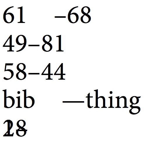
With XeTeX, one could perhaps play with interchartoks (in plain-xetex):

\font\test="Minion Pro"
\test
\XeTeXinterchartokenstate=1
\newXeTeXintercharclass\Tight
\newXeTeXintercharclass\Dashes
\XeTeXcharclass`1=\Tight
\XeTeXcharclass`b=\Tight
\XeTeXcharclass`–=\Dashes
\XeTeXcharclass`—=\Dashes
\XeTeXinterchartoks\Tight\Dashes={\kern1em }
\XeTeXinterchartoks\Dashes\Tight={\kern-1em }

61–68\par
49–81\par
58–44\par
bib—thing\par
2–18
\bye

enter image description here

Note that the above is using an OTF font which has en-dash and em-dash in their Unicode positions.

3
  • that does look amazing, but i'd really like to stick to latex.
    – emily
    Commented Jul 6, 2012 at 14:40
  • @emily: do you mean pdflatex? The above should work with xelatex (just add a documentclass, begin{document}, and change \bye to \end{document}).
    – morbusg
    Commented Jul 6, 2012 at 14:45
  • yes i do mean pdflatex, sorry.
    – emily
    Commented Jul 6, 2012 at 17:47
4

You are right. I suggest to solve it this way:

    \documentclass[11pt]{amsart}
\begin{document}

61--\,68
49--81
58--44
bib---thing

\end{document}

I agree, a small space is needed: \,.

5
  • 3
    Could you add a before-after screenshot?
    – doncherry
    Commented Jul 1, 2012 at 21:51
  • 2
    it definitely looks better that way but it would be rather time consuming to add that every time there is a spacing issue. it also doesn't create consistency.
    – emily
    Commented Jul 2, 2012 at 14:51
  • @emily It does not seem very time consuming to replace every --6 with --\,6. If your editor is somewhat complexer, you may even use regular expressions, ... [6,8] or thelike. In the end (and at the very end of writing a paper or a book), the finishing touches take half an afternoon.
    – Keks Dose
    Commented Jul 2, 2012 at 15:19
  • 2
    @KeksDose: No, always just replacing --6 with --\,6 is not a good idea. For 3--6, for example, this wouldn't look good. The point here is rather the 1--, I think. Commented Jul 2, 2012 at 16:46
  • 3
    every combination of letters and numbers look somewhat different. surely there's a way to improve this without manually adjusting every single instance?
    – emily
    Commented Jul 2, 2012 at 19:50

You must log in to answer this question.

Not the answer you're looking for? Browse other questions tagged .