4

Nitpicking mode activated.

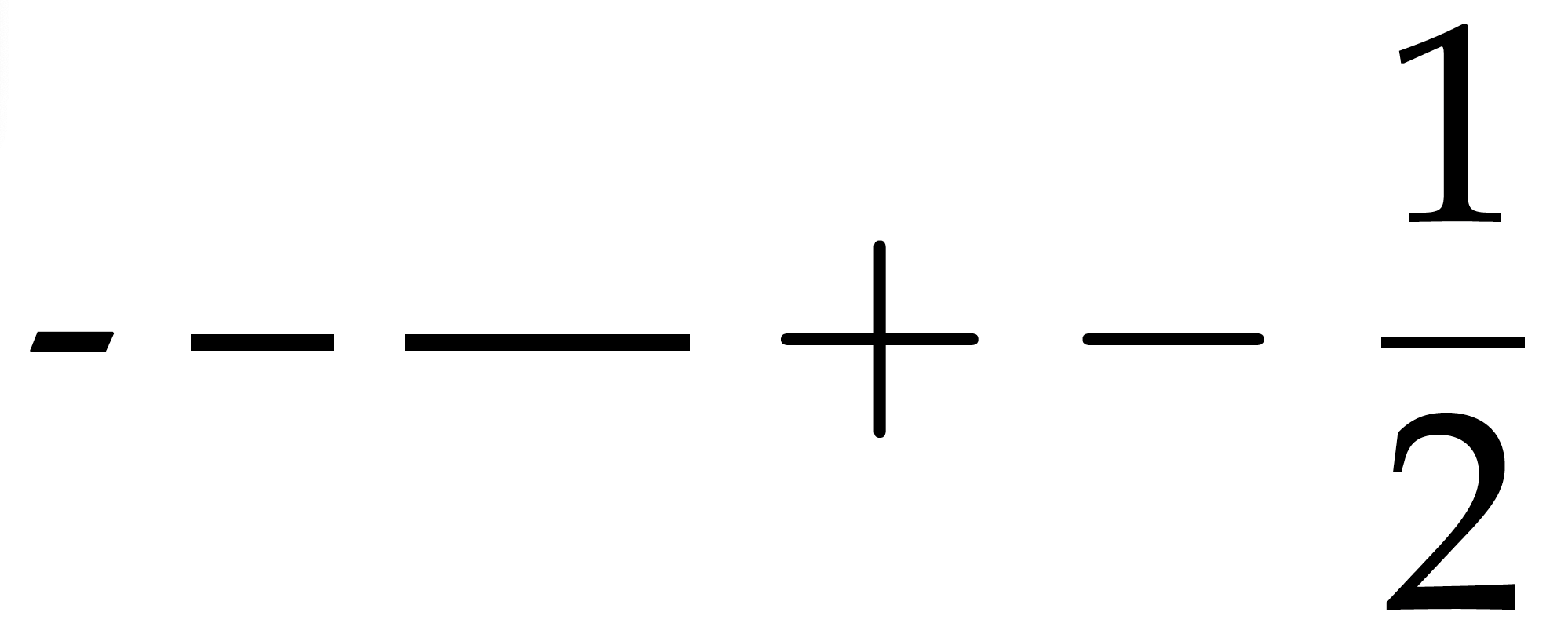
When using URW Palladio, the en-dash and em-dash glyphs are inconsistent with the glyph of the hyphen. Similarly, the glyphs for math operators are inconsistent with the glyph of the hyphen.

MWE:

\documentclass[border=1pt]{standalone}
\usepackage{mathpazo} 
\begin{document}
- -- --- $+ - \displaystyle\frac{1}{2}$
\end{document}

Output:

enter image description here

By "inconsistent", I mean that the calligraphic style of Palatino, which is evident in the hyphen's pen-formed terminals, is not used in the en- and em-dashes; the plus-, minus-, and equal-signs; and the fraction bar. (In addition, the terminals in the plus-, minus-, and equal-signs are semi-circular whereas the terminal in the fraction bar is rectangular.)

I have two questions:

  1. Has anyone addressed these inconsistencies already? (Apologies if I missed anything.)
  2. If not, how could I fix them only for the affected glyphs without creating a whole new font? (That is, how could I adapt the definition of the hyphen in mathpazo to maintain consistency?)

(There are other inconsistencies, but these are the ones that bother me the most.)

8
  • 2
    your question suggests you think you're using a single font, but you're not. you're using a mixture of different fonts which include urw palladio, but also computer modern (roman and maths) and a different palatino lookalike made by somebody else. so you first need to determine which fonts contain the glyphs which bother you. you then need to decide how you want to address the inconsistencies. once you do that, you should create a new set of fonts (to avoid confusion with mathpazo) and font support files. have you considered just using a different font? there are more coherent options by now
    – cfr
    Commented Nov 23 at 9:25
  • I think the endash and emdash are a design choice on the part of the font designer, though. those don't look like borrowings from cm, for instance. the strokes in maths are another matter ....
    – cfr
    Commented Nov 23 at 9:28
  • 3
    @cfr - You wrote, "I think the endash and emdash are a design choice on the part of the font designer." Indeed -- the rectangular shapes of endash and emdash are not unique to mathpazo (a Palatino clone), but also feature in non-clone Palatino, Palatino Linotype, Palatino nova, etc. If the shapes of the glyphs were good for Hermann Zapf, who are we to argue? :-)
    – Mico
    Commented Nov 23 at 12:02
  • @cfr - I was under the impression that I'm using just one font, URW Palladio. (As far as the \usepackage command and the two following lines are concerned, I followed tug.org/FontCatalogue/urwpalladio/.) Following your comment, I used Acrobat Reader to check and it lists what looks like about 50 fonts, many of them starting with CM, which I assume is Computer Modern. How would I go about figuring out which glyph comes from which font? Commented Nov 23 at 14:51
  • @cfr - Regarding your question about using a different font: Yes, I'm open to it. Which fonts are more coherent? Commented Nov 23 at 14:56

4 Answers 4

6

All the dashes are purely a feature of the font so to answer

how could I fix them only for the affected glyphs without creating a whole new font

basically you can't. You need to design new glyphs, you could of course have a new font with just the dashes then arrange that font is used just for those symbols.

The fraction bar is different, that is not a glyph from a font, it is a rule drawn by TeX, as such it is necessarily rectangular. To change that you would have to not use the TeX \over primitive, but instead use a fraction with no bar (\atop) and then draw a stylized rule using Tikz or a similar drawing package.

2
  • Assuming that I would design new glyphs for en- and em-dashes and perhaps for the plus and minus signs, how would I go about using them while leaving everything else the same? Commented Nov 23 at 15:19
  • @user1362373 assuming this is 8 bit fonts for pdftex not the opentype for luatex then it's a bit hard to redefine ligatures, you could easily define \textendash to switch to your font, if you want -- and --- to work with no explicit font change it's probably easiest to modify the virtual font to pull in your glyphs (which isn't too hard you just need a text editor not any font tools) Commented Nov 23 at 15:26
3

I would question the claim that the mathpazo package (which provides a Palatino clone) exhibits an inconsistency regarding the shape of the glyphs for the "simple" hyphen character, the en-dash, and the em-dash.

More precisely, if there's an inconsistency at all, it's also present in the non-clone Palatino font face -- and in Palatino Linotype and Palatino nova too. Consider the output of the following MWE (LuaLaTeX required for compilation):

enter image description here

\documentclass[border=1pt]{standalone}
\usepackage{fontspec}
\setmainfont{Palatino} % or 'Palatino Linotype' or 'Palatino nova' or...
\begin{document}
az - -- ---
\end{document}

Observe that the en-dash and em-dash glyphs do not share the "pen-formed terminals" of the hyphen character glyph. Aside: The longer dashes are also a bit thinner than the hyphen character.

If there really is an inconsistency that needs addressing, one would have to take it up with Hermann Zapf or, rather, whoever may be in charge at present of administering the Palatino font.

5
  • Is it possible that Hermann Zapf only designed the glyph for the hyphen but not those for the en- and em-dashes? As far as fonts are concerned, I'm merely an interested novice, but it does not look like they were designed by the same person. Could it be that the original Palatino only included the hyphen and that the en- and em-dashes were added by someone else, almost as an afterthought? Commented Nov 23 at 15:10
  • @user1362373 - Is something like the scenario you describe possible? I suppose almost anything in life is possible. Is it likely that a highly trained and supremely accomplished font designer, such as Hermann Zapf, wouldn't take a personal interest in designing all glyphs of a prominent font family? I think not. By the way, the Aldus font, also designed by Zapf and quite similar in many ways to Palatino, has the same property regarding the shapes of hyphens, en-dashes, and em-dashes. I thus have a strong hunch that Zapf did this on purpose, even though I have no idea why he did it.
    – Mico
    Commented Nov 23 at 15:20
  • 3
    @user1362373 I don't think this looks inconsistent, personally. the hyphen joins words together. the angles of the ends fit well with many kerning pairs. emdashes and endashes indicate separation/breaks/distancing or a range. so they play very different roles in communication.
    – cfr
    Commented Nov 23 at 15:43
  • @Mico - I agree with you that it seems unlikely. Though, just now I went to look at Robert Bringhurst's book "Palatino: The Natural History of a Typeface", and there is a picture of a proof of the Palatino font from 1949 in which only the hyphen appears and it looks like in the output of the MWE. (The en- and em-dashes do not appear.) This doesn't prove anything, of course, as Hermann Zapf could have added them later on, but it also doesn't rule out the possibility, however unlikely, that someone else added them later on. Commented Nov 23 at 16:09
  • @user1362373 - Thanks for this additional tidbit of information. The fact that Palatino Linotype and Palatino nova, which were created (with Zapf's full participation) decades after the original Palatino, fully maintain the for-you-problematic stylistic differences among the dash-like glyphs is, for me, a strong indicator that these differences are indeed intentional.
    – Mico
    Commented Nov 23 at 16:36
3

Instead of the old mathpazo package, that tries to setup a full set of text and math fonts using a mixture of a free Palatino look-alike and CM fonts, I would suggest to use LuaLaTeX or XeLaTeX and TeX Gyre Pagella:

\documentclass[border=1pt]{standalone}
\usepackage{pagella-otf}
\begin{document}
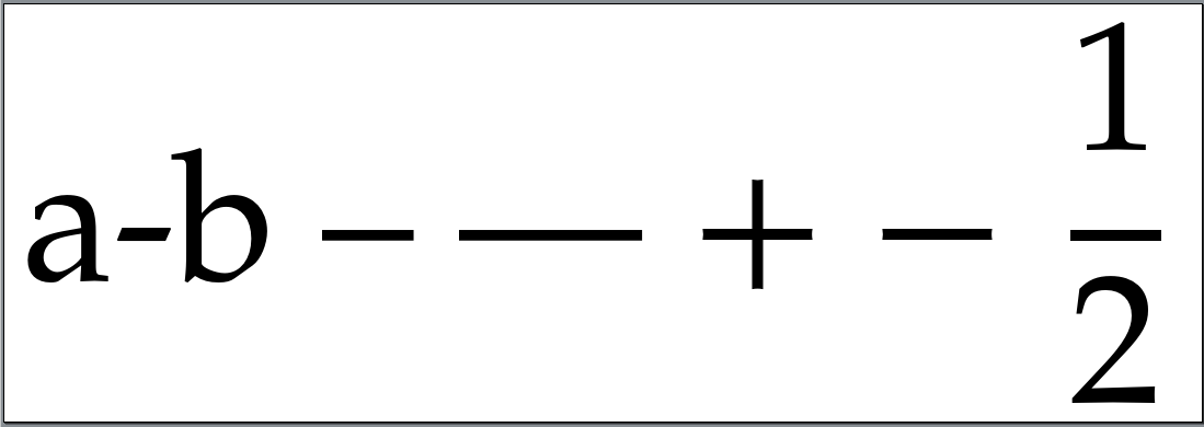
a-b -- --- $+ - \displaystyle\frac{1}{2}$
\end{document}

Nevertheless, the hyphen uses still another shape than en-dash or em-dash:

using LuaLaTeX and TeX Gyre Pegella with more consistency in line thickness

mainly because the famous typographer Hermann Zapf has designed Palatino this way.

I can only guess, why he used a different kind of shape for the hyphen. The font was made for the Stempel AG in Frankfurt am Main. In German the -, but not (with TeX input --) is used for compound words. So there is not need to design an en-dash similar to the hyphen. Maybe for languages that use the en-dash for compound words, another en-dash shape would also make sense. Or maybe the other shape for the - does only make sense, because it is stronger bound to the letters of a word and the has more the character of a separator or even a space. I don't know.

2

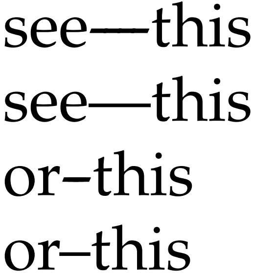
I agree with the other answers that this is how the font is designed. However, if you really want the dashes to resemble the hyphen, you can construct them yourself. Note, however, that this will break copy/paste from the pdf file.

\documentclass{article}

\usepackage{newpx}

\newcommand*{\myemdash}{\leavevmode\hbox to1em{-\hss-\hss-\hss-}}
\newcommand*{\myendash}{\leavevmode\hbox to.5em{-\hss-\hss-}}

\begin{document}
see\myemdash this\par
see---this\par
or\myendash this\par
or--this
\end{document}

The "bumpiness" is an artefact of my pdf viewer: it comes and goes depending on the magnification.

You must log in to answer this question.

Not the answer you're looking for? Browse other questions tagged .